About Form Designer Controls
When you drag and drop a component or when you click the Edit  icon of a form component, the configuration wizard opens. Depending on the type of form component, certain wizard tabs are available, to customize it. All tabs available and their general properties in the UiPath Form Designer are described below.
Display
Label
The title of the component.
Label Position
The position of the label for a field.
Description
The text that appears below the input field.
Tooltip
Adds a tooltip icon on one side of the icon. Input the text of the tooltip.
Custom CSS Class
Add a custom CSS class to the component. You can add multiple classes, separated by a space.
Hidden
Hide a component in the Form Renderer.
The component still appears in the JSON file.
Hide Label
Hide the label of a component.
Disabled
Disable a field in the form.
Placeholder
The text that appears when the field is empty.
Prefix
The text that is displayed before a field.
Suffix
The text that is displayed after a field.
Unique
When checked, the field is considered unique to the form.
Protected
When checked, makes the field available for input-only.
Persistent
When checked, it stores a field in the database. If you don't want to save a field to the database, uncheck Persistent.
Table View
When checked, shows the value within the table view of the submissions. You can use it for child components that you add inside Edit Grid components, to render the child components inside rows.
If left unchecked, the data doesn't display in the collapsed row of the Edit Grid. Even if the data doesn't display, you can configure a component while editing a row.
Input Mask
An input mask provides a predefined format. For example, for a phone-number field, the default input mask would be (999) 999-9999.
Input mask elements are:
9- numerica- alphabetical*- alphanumeric
Data
Default Value
The value of the field before users interact with it. The default value overrides the placeholder text.
Multiple Values
When checked, multiple values can be added to the field. The values appear as an array in the API and an Add Another Button is visible on the field.
Content
The section where you type the content of a component.
Data Format
The moment.js format you use for saving this field. For example, HH:mm:ss.
Redraw On
Redraw this component if another component in the form changes. Choose the event when the component should redraw from the dropdown list. The default events to choose are Any Change and Submit.
Validation
Required
When checked, this field is required to have a value.
Validate On
Determines when this component triggers front-end validation. Choose an event from the dropdown list: Change or Blur.
Minimum Length
The minimum length requirement this field must meet.
Maximum Length
The maximum length requirement this field must meet.
Minimum Word Length
The minimum amount of words that can be added to this component.
Maximum Word Length
The maximum amount of words that can be added to this field.
Regular Expression Pattern
The regular expression pattern that the component must pass before the form can be submitted.
Error Label
The label that displays when a validation error message shows.
Custom Error Message
A customized error message to be displayed if an error occurs.
Allow only available values
When checked, performs a validation check to make sure the value selected is an available option.
Field Key
Property Name
The corresponding argument name for a component in the Workflow Fields Collection.
Conditional
The Conditional tab in the Form Designer allows you to place conditions on components in your form, to hide or display them.
The Conditional tab has two sections:
- Simple
- Advanced Conditions
Simple conditions
The Simple section of the Conditional tab allows you to hide or display a component, based on the value of another component.
The Simple section consists of three fields:
-
This component should Display - from this dropdown list, choose:
- True if you want to condition when the component displays.
- False if you want to condition when the component hides.
-
When the form component - from this dropdown list, choose a component in the form to act as a condition.
-
Has the value - type in the value that conditions the component when to display or hide.

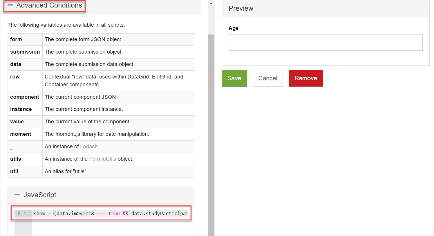
Advanced conditions
The Advanced Conditions section allows you to use JavaScript code to make combinations of conditions.
Advanced Logic overrides the results of Simple conditional logic.
In the JavaScript code section, enter a custom JavaScript code.
The show variable must be given a true or false value. The data variable is used to access other components in the form, through the API key.
To learn how to use conditional components, check the Conditional components tutorial page.
Logic
The Logic tab of the Form Designer allows you to create conditions and advanced logic scripts that can change the state or the behavior of the selected form component.
Using advanced logic, you can dynamically change the controls, look, and feel of a form component.
A form logic consists of two parts: the trigger and the action.
Trigger
The logic trigger is the condition upon which the action takes place. For example, you may want to display a specific form field only when a checkbox option is selected. In this case, the checkbox option is the trigger, and displaying the form field is the action.
There are four types of logic triggers:
| Trigger type | Description | Example |
|---|---|---|
| Simple | You define one triggering form component and value. | 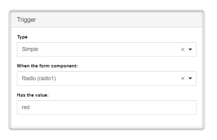 |
| Javascript | You provide a JavaScript logic for a form component or form data. Use the JavaScript syntax to create complex logic, such as loop or dynamic behavior. | 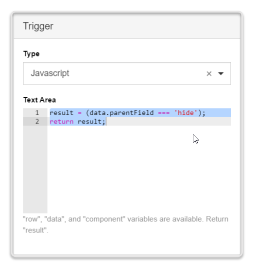 |
| JSON Logic | You provide a JSON logic for a form component or form data. Recommended in cases where JavaScript is not permitted. Cannot support loops or dynamic behaviors. | 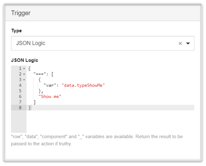 |
| Event | You define a component event, which once emitted by the corresponding component, triggers the desired action. | 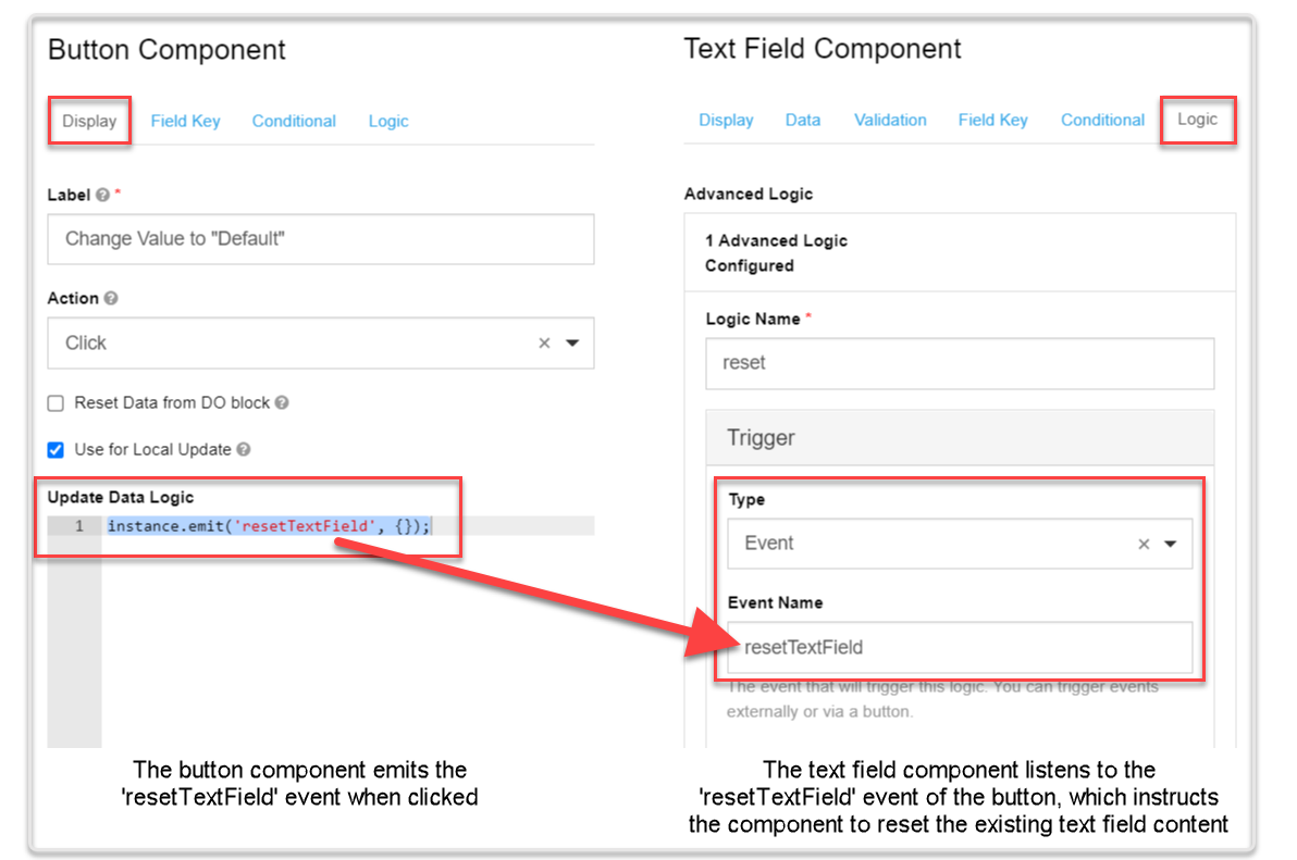 |
Action
The logic action is the form component behavior that should happen based on the logic conditions you set (i.e., the trigger). For example, you may want to activate a button for users of a specific age. In this case, the age range is the trigger, and activating the button is the action.
There are four types of logic actions:
| Action type | Description | Example |
|---|---|---|
| Property | The trigger changes one of the available component properties, such as Tooltip, Description, CSS class, etc. The available properties depend on the type of the triggering component. | 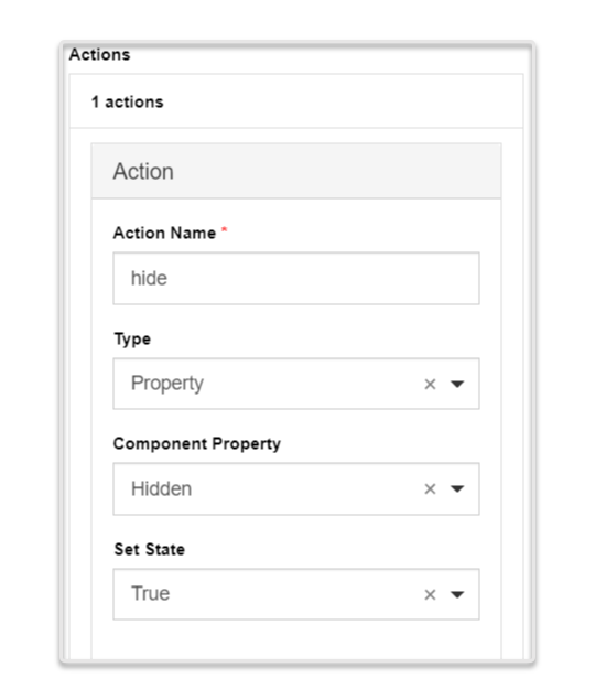 |
| Value | The trigger changes the value of the corresponding component. The action must be defined using JavaScript syntax. | 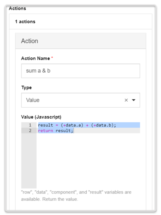 |
| Merge Component Schema | The trigger changes the component schema parameters found in the component JSON. To see the schema parameters you can change, hover over the corresponding component and click Edit JSON. You can change multiple parameters within one action. | 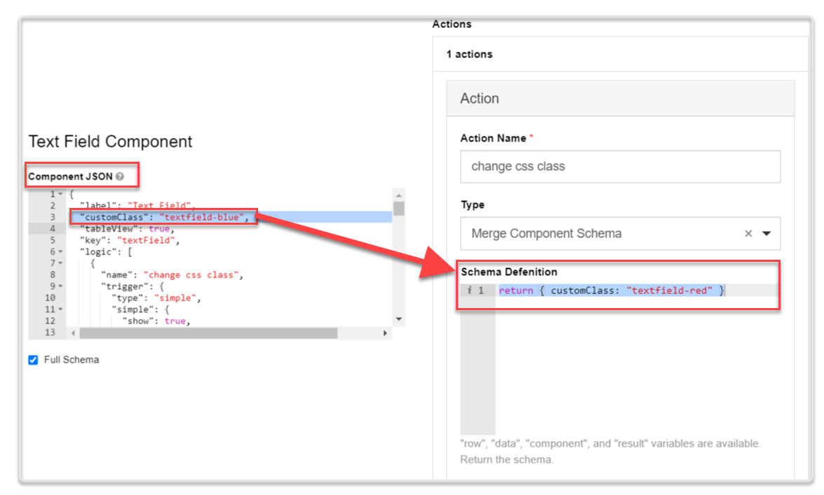 |
| Custom Action | You define a custom action using JavaScript syntax, in the same way you would define the JavaScript trigger type. | NA |