Getting Started
UiPath Form Designer is a customized implementation of the form.io engine that provides a drag-and-drop form builder experience in UiPath Studio.
As an RPA Developer, you use the UiPath Form Designer to build form interfaces that are required in an attended or unattended automation. You set the definition, behavior, and validation for every form field.
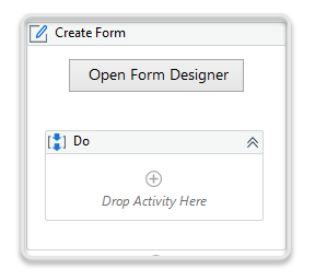
To interact with the Form Designer, select Open Form Designer inside the Create Form activity.
Form Components
A Form component provides you with the ability to collect user data. The UI components are grouped into categories, based on their functionality, as follows:
| Form Component Category | Description | Form Component |
|---|---|---|
| Basic | Contains the most used form fields. | Text Field, Text Area, Number, Password, Checkbox, Select Boxes, Label/Header, File/Folder, Drop-down List, Radio, Button |
| Advanced | Contains personal or time-related data. | HTML Element, Content, Email, Phone Number, Date / Time, Day, Time, Currency, Survey |
| Layout | Contains elements that alter the layout of the form. | Columns, Panel, Table, Tabs |
| Data | Contains grids and containers specialized for harvesting data. | Hidden, Container, Data Grid, Edit Grid, Grid |
To create a custom form, drag the desired UI components, drop them to the right side panel, and arrange them to the logic of your use-case.
Check the About form components page to learn more about each form component and how to configure them.
Comparison between grid control components
The table below compares the capabilities of the grid controls available in the Form Designer. The table also describes the recommended scenarios for using each grid control component: Grid, Data Grid, and Edit Grid.
Legend: ✅ = Available ❌ = Not available.
| Capability | Grid | Data Grid | Edit Grid |
|---|---|---|---|
| Recommended scenarios | Displaying large number of data for read-only purposes (read-only capability) | Displaying a small set of data that need to be edited by the user (inline edit capability) | Displaying a small set of data that need to be edited by the user (sub-form inline edit capability) |
| Recommended number of rows | Unlimited (100 rows pagination support) | Not more than 100 rows. Risk of performance reduction beyond recommended numbers | Not more than 100 rows. Risk of performance reduction beyond recommended numbers |
| Recommended number of columns | Unlimited | Maximum 7 columns for 100 rows. Risk of performance reduction | Maximum 7 columns for 100 rows. Risk of performance reduction |
| Editable | ❌ | ✅ | ✅ |
| Pagination | ✅ | ❌ | ❌ |
| Sortable | ✅ | ❌ | ❌ |
| Filterable | ✅ | ❌ | ❌ |
| Column resizable at runtime | ✅ | ❌ | ❌ |
| Row grouping | ❌ | ✅ | ❌ |
| Logic & Conditions | ❌ | ✅ | ✅ |
| Extensive customization using templates | ❌ | ❌ | ✅ |
| Global search | ❌ | ❌ | ❌ |
Component Tabs
Once you select a form component, a wizard opens displaying several configuration tabs, to allow further customization for different functionality. Check progress in the preview pane of the wizard.
When you are satisfied with a component design, select Save.
The table below describes the settings available for the common wizard tabs.
| Wizard Tab | Description | Special Mentions |
|---|---|---|
| Display | Configure the way the form component is displayed. | The name you set in the mandatory Label field is passed as the PropertyName in the Field Key tab. |
| Data | Configure a default value that end users see in the text field. | Components that may hold multiple items (e.g., Selectboxes, Tab) can be defined here. |
| Validation | Configure validation requirements to enable other UI components. | |
| Field Key | Configure the component name you want to use further in the workflow. | By default, this value is passed from the Label field of the Display tab. |
| Conditional | Configure conditions for the component. | You can set advanced conditions, such as Javascript or JSON. |
| Logic | Configure the logic that triggers the conditions. |
Check the About Form Designer controls page to learn more about each wizard tab.
Using custom JavaScript logic may lead to security attacks, so make sure you understand the risk involved before implementing your JavaScript code.
Some form components have specific tabs, for example:
| Component | Wizard Tab | Description |
|---|---|---|
| Date / Time | Date | Configure the minimum and maximum dates available for selection. |
| Time | Configure the incremental step for hours and minutes. | |
| Day | Day | Configure the way the business user selects the day (incremental or from a drop-down list). |
| Month | Configure the way the business user selects the month (incremental or from a drop-down list). | |
| Year | Configure the way the business user selects the year (incremental or from a drop-down list), and also the minimum and maximum year available for selection. | |
| Edit Grid | Templates | Customize the headers and rows of your edit grid data. |
Managing Form Components
 To reopen the configuration wizard, hover over the form component and select Edit.
 To rearrange the form components, select Move and drag the form component to another location inside your form.
 To edit the form component using its JSON settings, select Edit JSON. This opens the component JSON, displaying all the available settings.
 To copy a component inside the form, select Copy and then select
  Paste below on the same component or on another one.
 To remove a component from your form, select Remove.
Managing Forms
The Form Designer ribbon has the following options:

- Save—Saves the form you have designed.
- Save As Template—Enables you to export the form you have designed as a template that can be reused in future automation processes.
- Insert Template—Lets you browse for existing form templates and add them to the current project.
- Clear Form—Deletes all components in the current form.
- Preview—Enters a preview mode that shows you how the form looks like at runtime. This section also enables you to resize the display size of the form, or select a premade theme.
Customizing Themes
To customize a premade theme to your preference:
- In the Preview mode, navigate to the Themes panel.
- Select a premade theme.
- Select Customize Current Theme.
- Customize the form and the primary button using the available options.
- Select Save Customization.
note
Renaming a customized theme creates a clone for it. The theme is cloned to avoid breaking workflows that use the same theme, but reference it with the previous name.