Using the Grid Component
The Grid component allows you to display an unlimited number of rows and columns. The Grid component also allows you to paginate, filter, sort data, and resize the column width at runtime.
Prerequisites
Have UiPath.Form.Activities v2.0.2 package or higher installed.
Sortable
You can sort data inside columns in ascending or descending order. You sort the data at runtime, in the Form Renderer.
The data in the Grid is displayed in the same order as in the input data table. To sort all data in the Grid click any column header in the Form Renderer.
-
First click sorts the data in ascending order.
-
Second click sorts the data in descending order.
-
Third click restores the original order.
Filterable
You can filter data inside each column. You filter the data at runtime, in the Form Renderer.
To filter data in a column:
- Hover over the column header and click the triple bar
 menu.
menu. - Choose a filtering operation.
- Input a value in the Filter field of the triple bar menu. The input value in the Filter field is a condition for the filtering operation.
Based on the type of data, the following filter operations are available:
| Filter operation | Text | Number | Date/Time |
|---|---|---|---|
| Contains | ✅ | ❌ | ❌ |
| Not contains | ✅ | ❌ | ❌ |
| Equals | ✅ | ✅ | ✅ |
| Not equal | ✅ | ✅ | ✅ |
| Starts with | ✅ | ❌ | ❌ |
| Ends with | ✅ | ❌ | ❌ |
| Less than | ❌ | ✅ | ✅ |
| Less than or equals | ❌ | ✅ | ❌ |
| Greater than | ❌ | ✅ | ✅ |
| Greater than or equals | ❌ | ✅ | ❌ |
| In range | ❌ | ✅ | ✅ |
| Blank | ✅ | ✅ | ✅ |
| Not blank | ✅ | ✅ | ✅ |
For all filtering operations applied on Text and Number data, you can add an additional filtering operation, using the operators:
- AND - displays data if both filter operations are true.
- OR - displays data if any of the filter operations is true.
Column(s) Resizable
You can change the width of the columns at runtime, in the Form Renderer. The Column(s) Resizable capability allows you to see the data inside columns better.
To resize columns, hover your cursor over the border that separates the columns, until the two-way arrow  appears. Drag the border until you get the desired column width.
Pagination
You can display the data of the Grid component on pages that are numbered. The Pagination capability also includes setting the number of items per page.
To set the number of items per page: go to the Display tab of the Grid component and choose a value from the Items per page dropdown list. You can choose to display 10, 50 or 100 items per page.
At the bottom of the Form Renderer, at runtime you can view:
- The number of rows in the page that you are on.
- The total number of rows in the grid.
- The page number you are on out of the total number of pages in the grid.
You can browse through the pages by clicking the < > arrows or you can get to the first page by clicking the  arrow and last page by clicking the
  arrow.
Tutorial
To use the Grid component:
-
Drag and drop a Grid component in the Form Designer.
-
Go to the Field Key tab and change the Property Name to the input datatable argument from the FormFieldsCollection property of the Create Form activity.
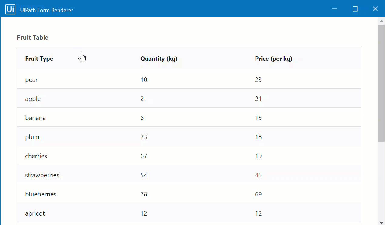
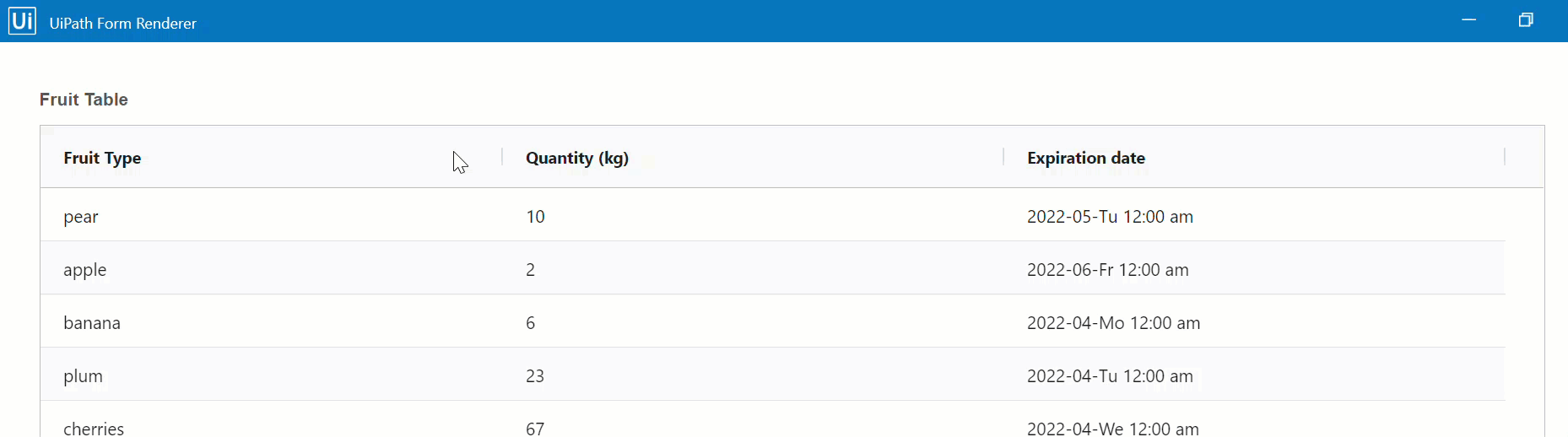
For this example, input
fruitDataTableArg. The data table argument binds the data in thefruit_table.csvfile to the form. -
In the Display tab, check the capabilities that you want to apply to the Grid component. For this example, check all four boxes: Sortable, Filterable, Column(s) Resizable, and Pagination.
-
In the Items Per Page field, choose from the dropdown list the number of items per page that you want to display in the form. For this example, choose
10. -
Save the component.
-
Drag and drop inside the Grid the form components that match the column values inside the input datatable. For this example, drag and drop the following components: one Text Field, one Number, and one Date/Time.
- Go to the Field Key tab of the Text Field component and change the Property Name to the name of the column that holds text data in the datatable. For this example, change the property name to
fruit. - Go to the Field Key tab of the Number component and change the Property Name to the name of the column that holds number data in the datatable. For this example, change the Property Name to
qty. - Go to the Field Key tab of the Date/Time component and change the Property Name to the name of the column that holds date/time data in the datatable. For this example, change the Property Name to
expdate.
noteMake sure to save form components before closing them!
- Go to the Field Key tab of the Text Field component and change the Property Name to the name of the column that holds text data in the datatable. For this example, change the property name to
-
Save the form.
-
Run the workflow and explore the Grid component capabilities.
Sample workflow
To check the complete workflow or to have a future reference, download the XAML example