September 2023
September 21, 2023
What is new
Data Transformations
Edit Data Transformations
With the new inline editor, you can edit the Data Transformations of your app directly in the browser. This means you do no longer have to export and import your transformations. Once you are done editing, you can run your customized transformations from the inline transformations editor.
Preview panels
In the Data Transformations editor, you can see the results of your queries in the new preview panel. By selecting one of the SQL files, you can see the data of the query next to the SQL code.
Preview input data
You can also preview the raw input data tables in the same interface. By clicking on an input table, you can view the raw data that was uploaded.
Known issues
- If there are many columns in the Data preview, the width is very small.
Creating metrics
You can now configure aggregation rules to create and edit metrics in the new KPI editor.
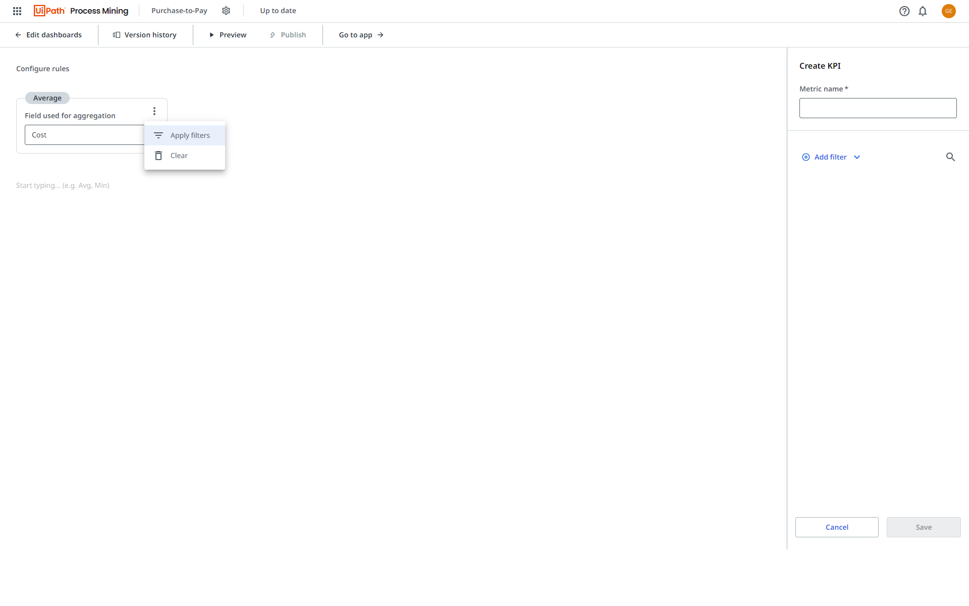
- You can apply filters to each aggregation of a rule.
- The
 icon is displayed next to the aggregation which enables you to preview the applied filters.
Marketplace recommendations
Marketplace recommendations has now been added to the Automation Potential dashboard. This allows you to investigate reusable RPA components to accelerate your automation journey.
Improvements
Automation potential dashboard
The following KPIs are now displayed at the top of the Automation potential dashboard:
- Automation rate
- Manual processing time
- Manual processing cost
- FTE
- Number of events.
Filter panel
The layout of the Filter panel was improved.
Bug fixes
Process apps
We removed type casting on already type-casted fields to prevent data conversion warnings.
For existing process apps, you can update your pm-utils to version 0.14.5 to benefit of this bug fix.
September 6, 2023
What is new
New app template available
The following app template is now available:
- Coupa Purchase-to-Pay
Customizing dashboards
You can now select the new Timeframe filter as a field for the x-axis of a line chart or a KPI chart.
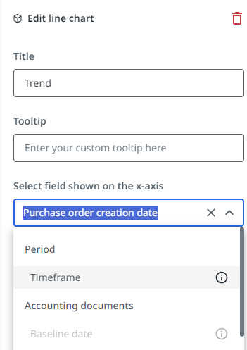
When a business user selects a different timeframe the x-axis on the chart will change accordingly.