Compare
Introduction
When in Compare mode, you can compare two sets of paths from your process. This enables you to visualize, compare, and analyze the performance of a process and its variations in all dashboards of your process app.
Displaying the Compare by panel
In the Compare by panel you can select which field you want to use for the comparison. To display the Compare by panel, select the Compare toggle.
The process app is displayed in Compare mode and the Compare by panel is displayed to the right.To hide the panel, select the Compare toggle again.
Compare is disabled for Root cause analysis, Automation potential and Process data. In Compare mode, the period filter is not available.
Adding a Compare by filter
Follow these steps to add a Compare by filter.
-
Select Add filter and select one or more fields for comparison from the drop-down list.
The Compare by panel displays two scenarios: A and B. Scenario A is the main scenario and Scenario B is the comparing scenario. Each scenario has a different color. These colors correspond to the colors of the two scenarios in the dashboard.
-
If you want to compare specific field values, select the desired values for the filters displayed in the Compare by panel.
If you have already specified filters in the Filter panel, these filters will be displayed in the Compare by panel. Initially, the filters are the same for scenario A and scenario B.
The compare filters are included in the page URL. This enables you to share the link to a compare view.
Removing Compare by filters
To remove any Compare by filters, select Clear all along the top of the Compare by panel.
The filters are cleared and both scenarios are removed from the Compare by panel.
Comparing
KPIs
Both scenarios are displayed for the KPIs in the context bar according to the color legend in the Compare by panel, which enables you to analyze the differences between the two scenarios for the KPIs. The value for Scenario A is displayed on the left and the value for Scenario B is displayed on the right.

For the larger KPI charts, for example on the Summary dashboards, both scenarios are displayed as trend lines according to the color legend in the Compare by panel, which enables you to analyze the differences between the two scenarios for the KPIs over time.

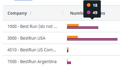
Bar charts
In the bar charts, both scenarios are visible for each bar. You can hover over a bar to view the context information.
Process graphs
With the process graph, it is possible to compare two different processes based on different fields or different time periods. Both scenarios are combined in the process graph. The following illustration shows an example.
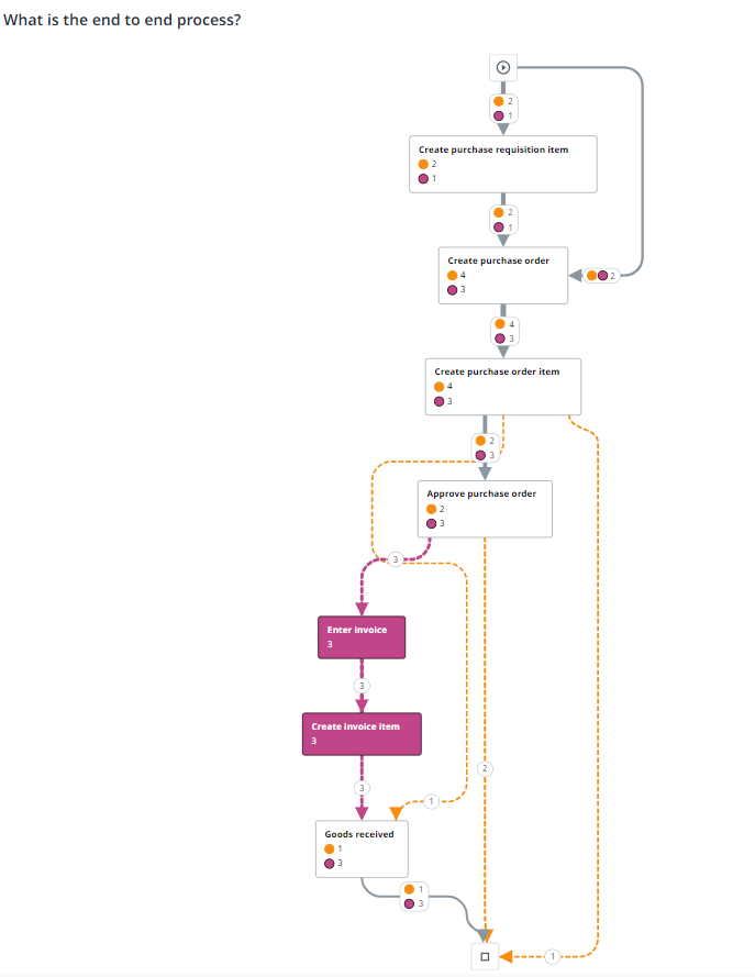
For the selected metric, both scenarios are visible on the edges. Similar activities for both Scenario A and Scenario B are white and activities that are different for Scenario A and Scenario B have the color of the scenario. Dotted lines indicate deviating edges.
When hovering over an edge, the context information is displayed.

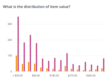
Distribution charts
In the distribution charts, both scenarios are visible for each bar. The following illustration shows an example distribution chart.
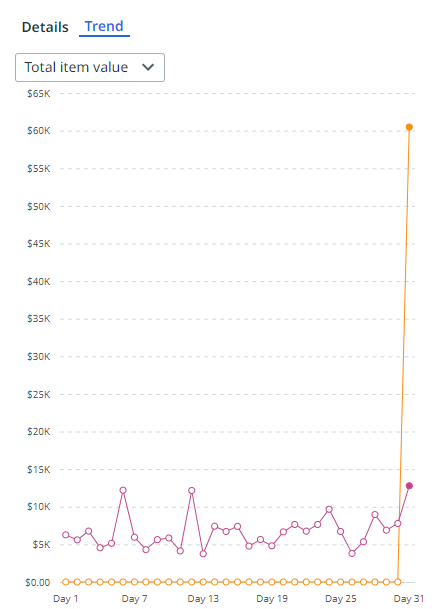
Line charts
In the line charts, each scenario is displayed as a separate line.The following illustration shows an example line chart.