Introduction to dashboards
Introduction
Process apps use data to visualize and analyze the actual end-to-end process, with all variants and relevant key performance indicators (KPIs). A process app consists of multiple dashboards, visualizing different parts of the input data.
Charts are dashboard items that are used to visualize data on a dashboard. For example a process graph, a bar chart, or a cross-analysis table.
A chart usually contains information about a specific part of the process, e.g. case information or event information. A dashboard can contain multiple charts.
Process app structure
The structure of a process app is defined by menus, dashboards, and tabs. End-users can navigate through the different menus, dashboards, and tabs.
Elements of a process app
The following illustration shows an overview of the different elements of a process app.
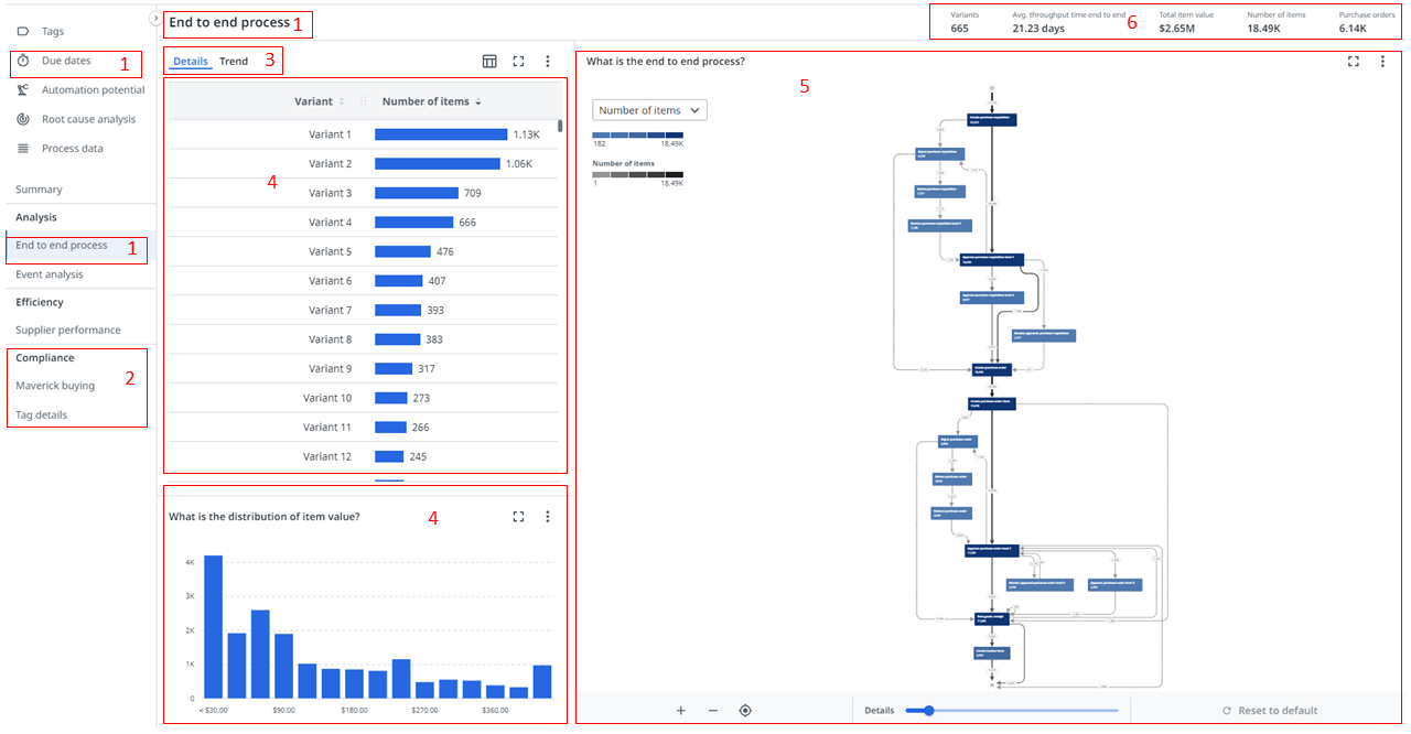
| Element | Description |
|---|---|
| 1. Dashboard | A collection of charts that visualize data in a meaningful way to end-users. |
| 2. Section | A group of dashboards. |
| 3. Tab | A group of charts. |
| 4. Chart | A graphical representation of data. |
| 5. Process graph | A chart that gives insight into how the steps of a process relate to each other and shows all possible paths that objects take through the process. |
| 6. KPI bar | KPIs to gauge performance of specific properties over time. |
Dashboards can contain a KPI bar, and multiple tabs, charts, and process graphs, that visualize data in various ways. In Process Mining you can customize the dashboards, and select different options for charts, process graphs, and KPI bars to create different views, and to organize, group, and filter data.