KPI trends lists
Introduction
KPI trend lists can be used to create a dashboard with a graphical representation of the main KPIs of the process that gives insight into the overall process performance. The following illustration shows an example of a KPI trends list.
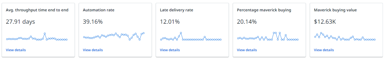
The View details button on a KPI trends list enables the user to go to the related dashboard for further analysis.
Properties
You can edit the properties of a bar chart in the Edit KPI list panel.
You can select different metrics for which you want to display a KPI charts. For each KPI chart you must select the field that is displayed on the X-axis. Furthermore, you can select the dashboard to which the View details button should be linked.
The following table describes the properties of the KPI list.
| Element |
Description |
|---|---|
| Tooltip |
Text box that enables you add a text that will be displayed as tooltip when the user hovers the mouse over the chart title in the published process app. |
| Metrics | List of metrics to be displayed in the KPI list. Use the Add metric option to select one or more metrics. Tip:You can drag and drop the metrics in the list to arrange the metrics as desired. |
| Select KPI chart |
Drop-down list that enables you to select the KPI chart for which you want to define the properties. |
| Format X-axis |
List box that enables you to select the field displayed on the chart. The Format X-axis is a mandatory property. Note: You can select the new Timeframe filter as a field for the x-axis of a line chart or a KPI chart. When a business user selects a different timeframe the chart will change accordingly. |
| Link to dashboard |
Drop-down list that enables you to select the dashboard that should be opened when the user clicks on View details . If you do not select a related dashboard, the View details button is disabled. |