Pivot table charts
Introduction
Pivot tables can be used to group data and to compare certain metrics. A pivot table shows the data in a tabular format and the fields are displayed as horizontal rows. The following illustration shows an example of a pivot table chart.
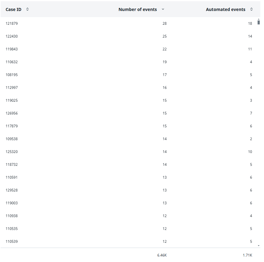
The total values for the metrics are displayed beneath the pivot table chart.
Properties
You can edit the properties of a pivot table chart in the Edit pivot table chart panel.
The following table describes the properties of the Pivot table chart.
| Element |
Description |
|---|---|
| Title |
Text box that enables you to edit the title of the pivot table chart. |
| Tooltip |
Text box that enables you add a text that will be displayed as tooltip when the user hovers the mouse over the pivot tab;e chart title in the published process app. |
| Fields |
List of fields to be available for the pivot table chart.
Note: You must at least selectone field for the pivot table chart. If you select multiple fields, the first field will be displayed by default. |
| Metrics |
List of metrics to be available for the pivot table chart.
Note: You must at least select and enable one metric for the pivot table chart. If you select multiple metrics, the first metric will be displayed by default. |