Line charts
Introduction
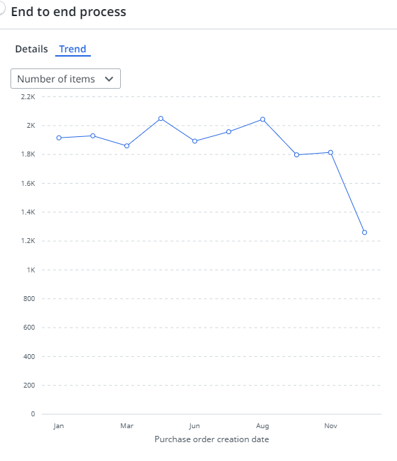
Line charts can be used to split data over different periods to show trends over time. The following illustration shows an example of a line chart.
In a line chart you select the that field for which you want to display values on the X-axis. The Y-axis is used to display the variable values. By default the metric displayed on the Y-axis is the record count. If you want to display a different value, you can choose a different metric.
Properties
You can edit the properties of a line chart in the Edit line chart panel.
Below is a description of the properties of the Line chart.
| Element |
Description |
|---|---|
| Title |
Text box that enables you to edit the title of the line chart. |
| Tooltip |
Text box that enables you add a text that will be displayed as tooltip when the user hovers the mouse over the chart title in the published process app. |
| Field shown on the x-axis |
Combo box that enables you to select the field for which you want to display the values on the X-axis. Note: You can select the new Timeframe filter as a field for the x-axis of a line chart or a KPI chart. When a business user selects a different timeframe the x-axis on the chart will change accordingly. |
| Metric |
List box that enables you to select the metric displayed on the Y-axis. You can select multiple metrics to add them to the metric selector. |