Charts
Introduction
Dashboards contain data that can be grouped in different levels by using charts. In Process Mining you can edit the charts to customize them to your business needs. You can create a different view by using a different field or by changing the metric.
When you want to design a chart you take some steps:
- Determine the field for which you want to display the values on the chart.
- Decide the type of the chart that is most suitable for the information you want to display.
- Define the main metric that you want to use on the chart.
- Define the other metrics that might be relevant to use on the chart.
Chart types
The following table describes the chart types that are available and their purpose.
| Chart type | Description |
|---|---|
| Bar charts | Used to group data and to compare certain metrics. |
| Stacked bar charts | Used to compare different categories while also keeping track of the total value. |
| Distribution charts | Used to show the distribution of values of a numerical field. |
| Table charts | Used to display the values as a table with rows and columns. |
| Pivot table charts | Used to group data and to compare certain metrics. |
| Line charts (or history chart) | Used to split data over different periods to show trends over time. |
| Process graphs | Used to display a visual representation of the order in which events took place based on the data. |
| KPI trends lists | Used to display a graphical representation of the main KPIs of the process. |
| KPI values lists | Used to display a graphical representation of the main KPIs of the process. |
| Pie charts | Used to display the data in a circular graph. |
| Donut charts | Used to compare the relative proportions of a certain metric within a category. |
Editing a chart
To define the chart, you can define the properties for the chart. For a new chart, all the properties are empty and you can define the chart from scratch by editing the properties. Refer to Dashboards for more information. You can also edit the properties of existing charts.
Follow these steps to edit a chart.
- In the dashboard editor go to the dashboard for which you want to edit a chart.
- Select the chart you want to edit to select it.
The properties panel opens at the right, displaying the editable chart properties.
Tabs
Editing tabs
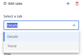
Follow these steps to edit a tab.
- In the dashboard editor go to the chart for which you want to edit a tab.
- Select the tab you want to edit from the Select a tab selector.
The following illustration shows an example of a tab selector.
Adding a new tab
Follow these steps to add a tab on a tile.
- In the dashboard editor go to the tile for which you want to add a tab.
- Select the Add a new tab icon
 in the Edit tabs panel.
A new empty tab is created on the selected tile. You can add a chart on the new tab. When you edit the name of the chart, this name will be displayed on the label of the tab. Check out Dashboards.
A chart can contain up to three tabs. If the chart already contains three tabs, the Add new tab button is disabled.
Removing a tab
Follow these steps to remove a tab.
- In the dashboard editor go to the chart for which you want to delete a tab.
- Select the tab you want to delete from the Select a tab selector.
- Select the Remove tab icon.

The selected tab is removed from the chart.
Switching display fields
To enable end-users to select a different view for the chart, you can select different fields that will be added to the selector. The following illustration shows an example of a field selector in a published process app.
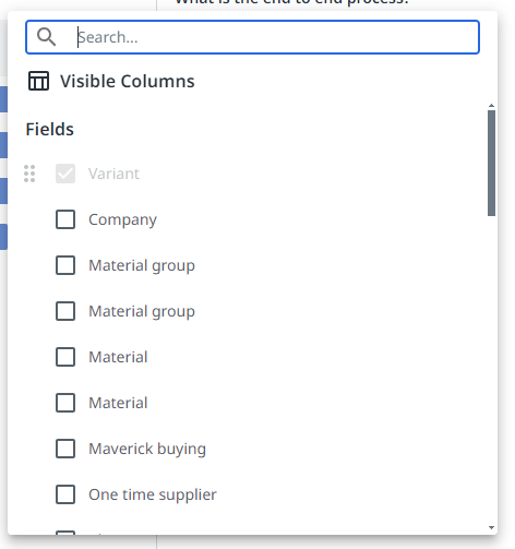
You can enable and order the fields that are visible as columns from the Fields list in Data Manager. Check out Hiding and showing fields.
Switching values
To enable end-users to switch between different values in the chart, you can select different metrics that will be added to the selector. When selecting metrics for a chart, all the available metrics defined for your process are listed.
Metrics in the list can have the same name. In this case, the metric is calculated differently. For example, based on a different field. You can hover over the Information icon ![]() to display context information for the metric. The following illustration shows an example.
to display context information for the metric. The following illustration shows an example.

The following table describes the elements of the context information.
| Element | Description |
|---|---|
| Aggregation | The function used to calculate the metric. • Count - the total number of records. • Distinct count - the total number of unique records. • Average - the average value of the field. • Min - the lowest field value • Max - the highest field value • Percentage - the percentage of values that are true • Sum - the sum of the field values. |
| Argument | The argument or field used to calculate the metric |
| Context metrics | The metric or metrics that provide context for the main metric. For example, if the main metric is defined as Average item value, a useful context usually is the Number of items for which the average amount is calculated. |
Adding chart filters
Chart filters enable you to filter data from the table before it is provided to the chart. With chart filters, you can create subsets of the data to create more specific visualizations that can be used by business users. When business users open a process app that contains one or more charts with chart filters, those charts will display data according to the chart filters.
When one or more filters are defined for a chart, the Chart filters icon ![]() is displayed at the top of the chart. Business users can select the icon, to view the applied chart filters.
is displayed at the top of the chart. Business users can select the icon, to view the applied chart filters.
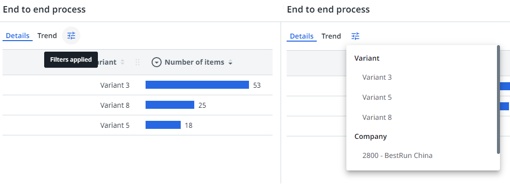
Business users can still add global filters, which are applied on top of the chart filters. But they cannot change the chart filters.
Adding a chart filter
Follow these steps to add a chart filter.
| Step | Action |
| 1 | Select the chart for which you want to add a chart filter. |
| 2 | Select Add filter in the chart properties panel. |
| 3 | Select the filter from the list of filters or search for the filter you want to add. |
After you define a filter for a chart, the ![]() icon is displayed at the top of the chart.
icon is displayed at the top of the chart.
Chart filters are similar to global filters. Check out Filters for a detailed description of available filters, process filters, and filter types.
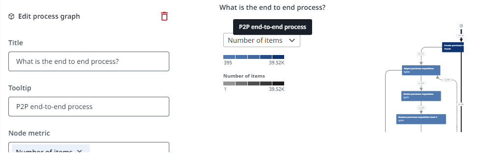
Adding a custom tooltip for a chart
You can add a custom tooltip for a chart. The tooltip will be displayed when the user hovers the mouse over the chart title in the published process app.
Follow these steps to add a custom tooltip for a chart.
| Step | Action |
| 1 | Select the chart for which you want to add a tooltip. |
| 2 | Enter the text you want to display as a tooltip for the chart in the Tooltip field. |