Adding a compare period filter to a dashboard
Introduction
Comparing data of periods in bar charts helps the end user analyzing data. In this way you can easily see if the data increased or decreased in the current period compared to the last period.
Follow these steps to add a period filter and the comparing period filter with a metric. The metric can be exchanged by any expression that calculates a number.
| Step | Action |
|---|---|
| 1 | Open your app in your development environment and click on the dashboard for which you want to add the period filter. |
| 2 | Go to the Chart tab and create a new period filter. |
| 3 | Drag the new period filter to the Right level of the Controls pane. |
| 4 | In the General pane, change Size to X2 Expression. |
| 5 | Click on expression and enter: metric([metric], filter(records, activeperiodfilter)) where [metric] is the metric you are using for the filter. |
| 6 | Go to the Advanced tab. |
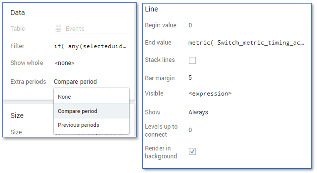
| 7 | Select Compare period from the list in the Extra periods field in the Data pane. |
| 8 | Right click in the Chart panel and select New overlay - Line to create new line overlay. |
| 9 | Enter the following values in the Line pane: • Begin value: 0 • End value: metric([metric], filter(records, not activeperiodfilter)) • Bar margin: 5 • Levels up to connect: 0. |
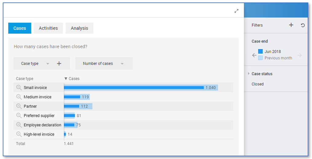
The dashboard now contains a filter that can be used to compare between periods on a dashboard. See illustration below for a dashboard containing the Case end filter.