Legacy charts
Introduction
Legacy charts are charts that are created with versions of UiPath Process Mining older than 2020.10.
Legacy charts will be deprecated in future versions of Process Mining. Although you still can create new legacy charts, you are strongly advised to create new charts. Moreover you should consider converting current legacy charts to new charts wherever possible.
Dashboards and charts
Dashboards contain data which can be grouped in different levels.
- Bar charts: the data can be divided horizontally (row levels)
- Scatterplots: the data can be split in X-axis and Y-axis levels
- Pie charts: the data can be split in slices, what is called pie level
- etc. The data in a chart can be divided by dragging and dropping attributes onto the desired levels.
Adding data to a chart
Follow these steps to add data to a default bar chart.
| Step | Action |
|---|---|
| 1 | Click on the chart to select it and go to the Chart tab. |
| 2 | Drag an attribute from the attribute list onto the Rows level, indicated by three dots. |
See illustration below for an example.
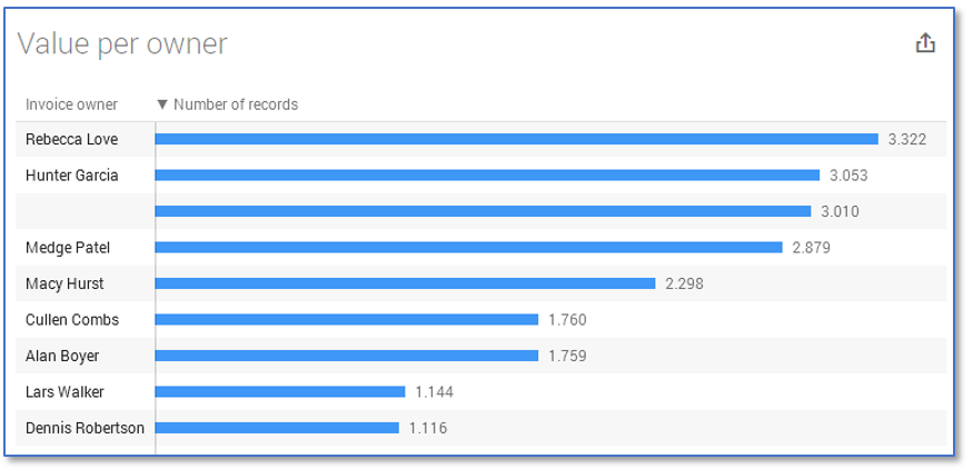
The dashboard now shows the Number of records per Invoice owner. Note that after dragging the attribute onto Rows, the dashboard is split and after each bar the number of records per row is displayed.
The size setting
The Size setting determines what attribute is used to define what the chart in the graph is measuring. By default, this is set to the sum of records.
Multiple levels
You can split your data even further using multiple levels. Extra levels can be added as a new row, or as a division of the existing rows. This is called stacked. Adding an additional attribute to Rows adds a level to your chart. This means that the information that is shown in the chart will display more categories.
Follow this step to add another level.
| Step | Action |
|---|---|
| 1 | Drag a second attribute to the Rows level below the first attribute. |
See illustration below for an example.
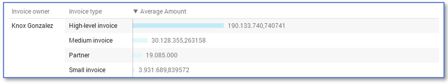
By adding another level, the values of the first level are split up and an extra column is added.
Stacked levels
Another way to add a level to the bars is to use Stacked instead of Rows.
Follow this step to use stacked levels in a chart.
| Step | Action |
|---|---|
| 1 | Drag an attribute from the attribute list onto the Rows level, indicated by three dots. |
| 2 | Drag a second attribute to the Stacked level. |
See illustration below for an example.
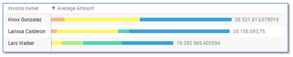
In this case, the different values are shown by colors on the bar instead of in an extra column.
Chart types
Below is an overview of all the legacy chart types and their purpose.
| Chart type | Desciption |
|---|---|
| Bar | The standard way of grouping data and to compare certain metrics. Stacks can also be used to show proportions of a second dimension. |
| Line | Shows trends over time, e.g. history graphs. |
| Multi Line | Shows comparison trends. |
| Cross table | Used to compare two dimensions. |
| Cross table bar | Similar to a cross table, but bars are added to compare the dimensions. |
| Distribution | Used to show the distribution of values of a numerical attribute. |
| List | Shows a certain concept per row and its properties as columns. |
| Column | A vertical bar chart. |
| Gannt | Shows the flow of a certain concept, e.g. events in an invoice. |
| Pie | Shows the proportions of a certain concept. |
| Scatterplot | Used to compare two numerical attributes. |
| Treemap | Used to show the hierarchy of values of a certain concept. |