Legends
Introduction
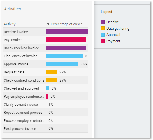
A legend is used to explain what the colors represent in a chart. See illustration below for an example.
Creating a Legend
Follow these steps to create a legend.
| Step | Action |
|---|---|
| 1 | Go to the Data tab. |
| 2 | Right click on the attribute or expression for which you want to create a legend and select New control - List box. |
| 3 | Right click on the new List box filter and select Edit.... |
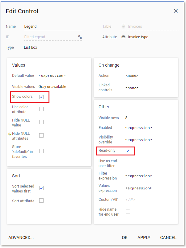
| 4 | In the Edit Control dialog select the Show Colors option in the Values panel and the Read-only option in the Other panel. See illustration below. |
| 5 | Click on OK. |
| 6 | Drag the List box filter to the Right level in the Controls panel. |
note
By default, a List box shows at most 8 entries at the same time. If more entries are available there will be a scrollbar in the legend. Consider the number of colors in your visualization and set the number of Visible rows accordingly in the Other panel of the Edit Control dialog.