Overview - Automation
Introduction
The dashboard Overview – Automation can be used to find automation opportunities in the process. For the selected attribute the Automation rate is displayed for the current and the previous period. The dashboard also displays information about the costs involved in the execution of an event which indicates the benefit of automating the event. See illustration below.
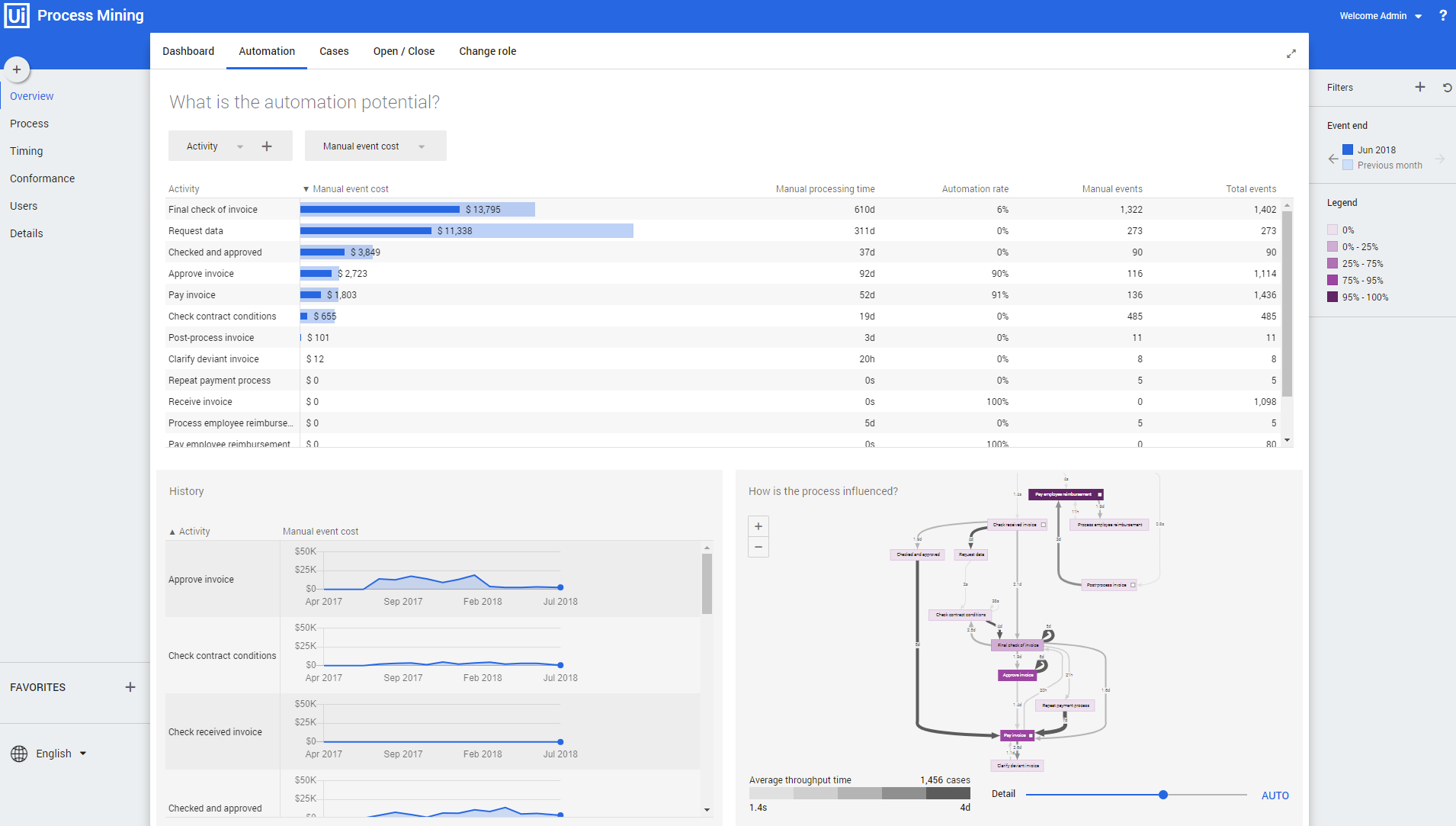
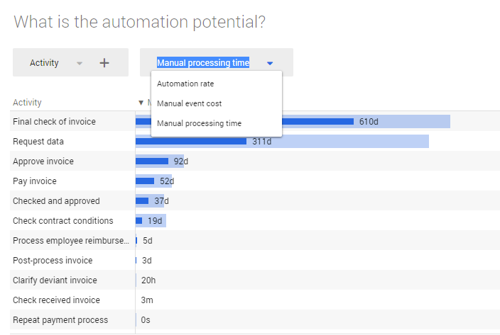
In stead of the Automation rate, you can select the Manual event cost, or the Manual processing time as the main metric to be displayed on the dashboard. See illustration below.
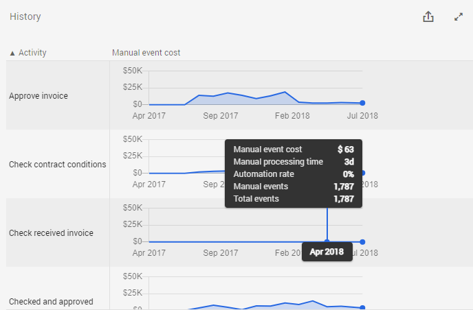
History graph
The History graph shows the metric values for the selected attribute over time. See illustration below.
Below is a description of the different metrics.
| Metric | Description |
|---|---|
| Manual processing time | The amount of time a person is actually working for the event. |
| Manual event cost | Represents the costs of executing an event. |
| Automation rate | Percentage of events that is automated. |
| Manual events | The number of events that are not automated. |
| Total events | The total number of events. |
Process graph
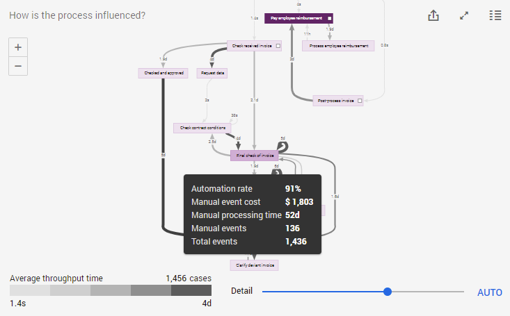
The process graph provides a visual representation of event costs related to the number of cases in the process. When hovering over an activity, the metrics are displayed in the hint. See illustration below.
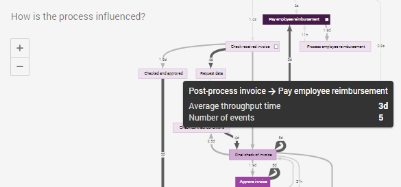
When hovering over an edge, the average throughput time and the number of events are displayed in the hint. See illustration below.
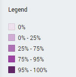
Automation legend
The colors of the activities in the process correspond to the percentage of automated events for each activity. See illustration below.