Exploring the user interface
As you explore the user interface, you'll discover various components and features that empower you to effectively manage your tasks and access the functionalities relevant to your user persona.
Portal navigation
Feature availability depends on the cloud platform you use. For details, refer to thefeature availability page.
Test Cloud and Test Cloud Public Sector
Test Cloud Dedicated
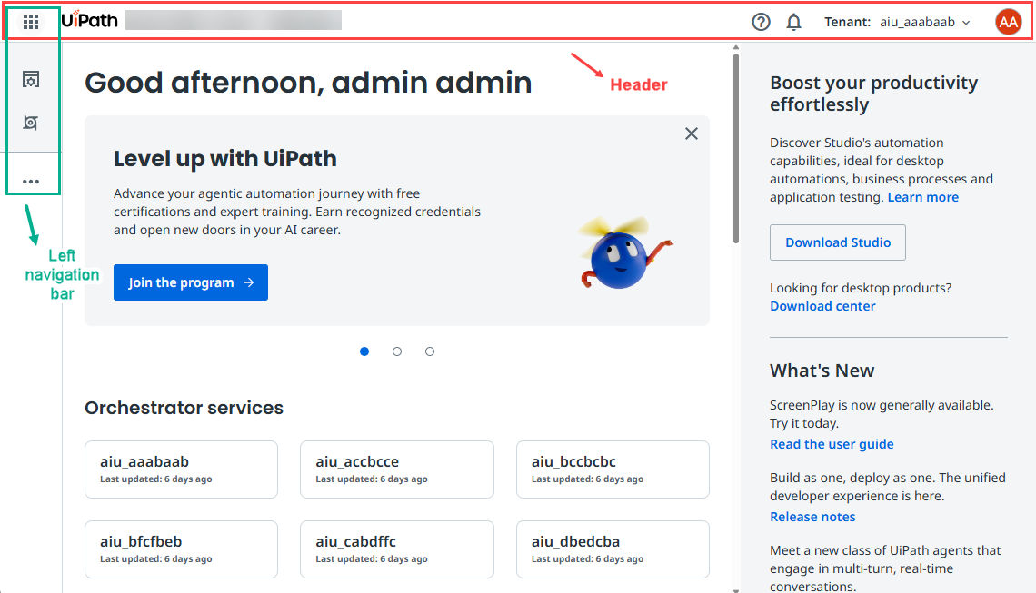
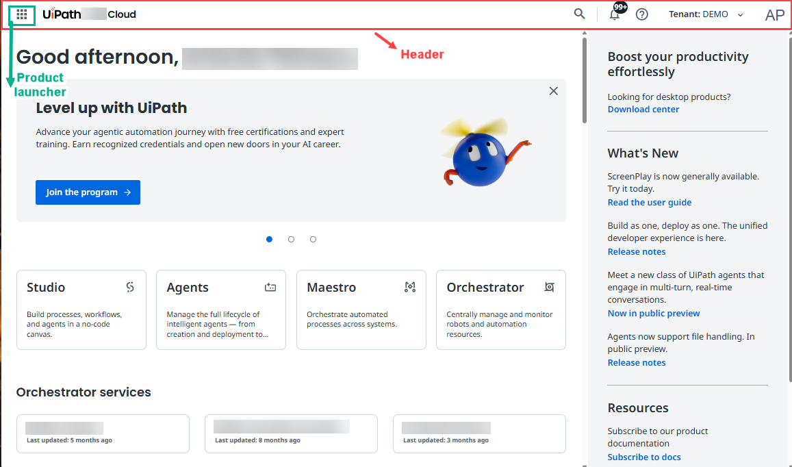
The header
The portal header provides the context of your location inside the platform. It is a persistent element that remains at the top of every page. Depending on the service context you are in, the header bar provides additional navigation capabilities that are specific to that service.

The portal header offers quick access to essential features and tools, as follows:
-
The app launcher - allows you to switch between different products or modules within the platform.
-
Your current location - shows your location within the platform.
-
The help menu - provides access to the UiPath documentation, support resources, enables you to submit feedback, and provides assistance channels for any questions or issues you may encounter.
noteThe documentation experience offers a search feature powered by generative AI. The search generates answers using UiPath's official documentation as a reference. While the search aims for accuracy, we suggest you cross-check the responses with the referenced documentation sources for complete precision.

-
The notification menu - keeps you informed about updates, alerts, and notifications relevant to your user persona and activities within the platform also allows you to configure notification settings. Refer to details about reading notifications and managing them.
-
The tenant picker - displays the active tenant and enables swift tenant switching.
-
The user menu - grants you access to your user profile preferences, allowing you to customize your experience as needed.
The product launcher or left rail
The product launcher or left rail provides quick and easy access to core sections of the platform, and displays your favorite services. The options displayed in the product launcher or left rail depend on your user persona and role. The product launcher or left rail displays the following options:
-
Product launcher:

- The numbers represent the following:
- Waffle icon: Expands the left rail when you select it.
- Favorite services icons: Help you switch between your favorite services and modules available within the platform, ensuring you can access the tools specific to your responsibilities. Note that you can only navigate the favorite services relevant to your user persona and you can choose a maximum of four favorite services.
- More options icon: Expands the left rail when you select it.
- Favorites section: Shows a maximum of four of your favorite selected services.
- Main section: Displays the Home, Studio, Orchestrator, Maestro, and Admin favorites.
- More section: Shows the rest of available services in alphabetical order.
- The numbers represent the following:
-
Left-rail:
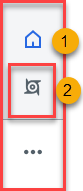
- The number represent the following:
- Home: Allows you to return to the Home page, your central hub for platform navigation and task management. The Home option is visible by default, and you cannot remove it from your favorites.
- Favorite service icons: Help you switch between your favorite services and modules available within the platform, ensuring you can access the tools specific to your responsibilities. By default, the following favorites are shown: Home, Orchestrator, and Studio. Note that you can view only the favorite services relevant to your user persona.
- Favorites: Shows the Home option and a maximum of three favorite services. You cannot remove the Home option from your favorites.
- All services: Displays all services and modules to which you have access. This is where you can add or remove services from favorites using the Favorite icon. Services and modules are grouped by UiPath pillar (Build, Discover, Operate) and a More category containing all remaining navigation links, including Admin for platform configuration and management.
- The number represent the following:
Home page
Feature availability depends on the cloud platform you use. For details, refer to thefeature availability page.
The Home page serves as the landing page for users after they log in. It is designed to provide a personalized experience based on your role within the organization and the services provisioned in the tenants you have access to.
For example, App testers view their test projects, apps, test execution history, and pending actions. As an administrator or an App Test Developer, you can quickly access your Orchestrator services and view metrics on license consumption and distribution.
The Organization Administrator role gives you full View permissions for the Home page. Users with the User role do not have View permissions on the following widgets on the Home page: usage trend and distribution of licenses.
Widgets
The Homepage is customized to cater to the application testing user persona, offered by Test Cloud. The following mapping illustrates the widgets available for the Application Tester and Application Test Developer personas:
- Carousel banner: Promotes getting started experiences, announcements, webinars, feature releases, and other application testing relevant content.
- Test Manager projects: Offers quick access to the Test Manager projects available in the current tenant.
- Recent test executions: Displays the recently run test executions.
- Orchestrator services: Quick-access cards to your Orchestrator tenants. Select Manage to land on the Tenants page, where you can edit the tenants and their enabled services, if you have the required permissions.
- License allocation: The snapshot view of user and robot license allocations, displaying the total number of licenses available in your organization versus the total number of licenses allocated. A license is considered allocated if it belongs to a service. The following tabs are available:
- Users - For user-specific licenses assigned to a user account, providing the right to use certain UiPath® functionality or products.
- Robots & Services - For robot and service specific licenses, used for executing unattended processes, or to provide certain functionality.
Home page experience with Test Cloud licenses
If you have a Test Cloud user license assigned — such as App Tester User or App Test Developer — the portal displays Test Cloud as the product name on the Home page, regardless of any other licenses you have or your role in the organization.
Users with any license that includes access to Test Manager, whether a Test Cloud or Automation Cloud license, also have access to Test Execution widgets on the Home page.
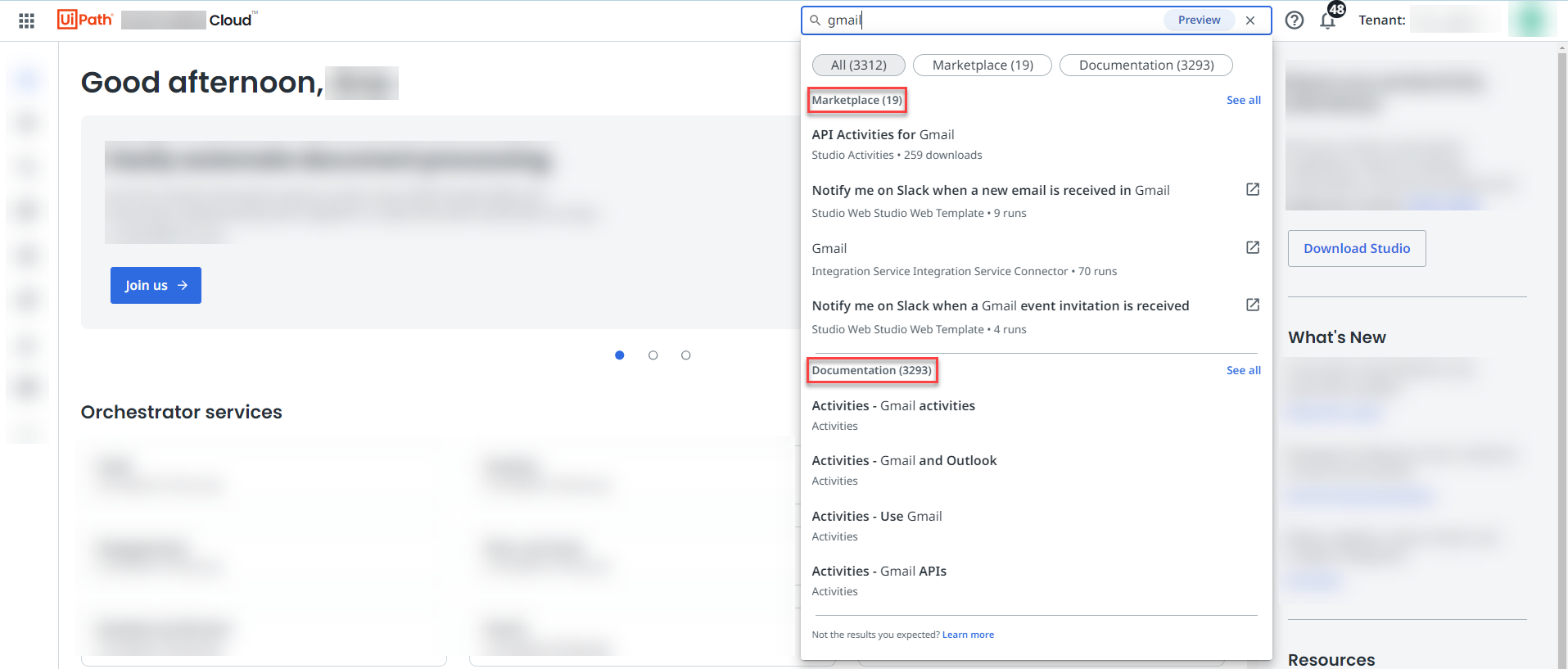
Search box
Feature availability depends on the cloud platform you use. For details, refer to the feature availability page.
The search box is displayed in the homepage header, and it retrieves information from the Marketplace and UiPath® documentation databases.
Search box functionality
In the following functionality examples, designed to show the behavior of the search box feature, we use gmail as a keyword.
-
Search: The first four Marketplace results are shown at the top, followed by the first four UiPath documentation results.
-
See all results: Select See all to be redirected to the respective search surface on Marketplace or UiPath documentation. Once redirected, the gmail search keyword shows up in the Marketplace and UiPath documentation search boxes as well.
Notifications panel
Notifications are displayed in the Notifications panel. To access the Notifications panel, select the bell icon, located in the top navigation bar.

Notifications settings page
You can modify the settings of your notifications from the Notifications settings page.
Select the user account icon, go to Preferences, and then go to Notifications.
You can also access the Notifications settings page through the Notifications panel. Select the settings icon in the Notifications panel.
Notifications page
The Notifications page keeps track of all the notifications that your organization received. The page allows you to check notifications that you cleared, but want to revisit.
To access the Notifications page, select the Notifications page icon in the top-right of the Notifications panel.
Notification subscriptions
To personalize notifications received in the Notifications panel, you can subscribe to, or unsubscribe from events or severity types.
Data retention policy for notifications
Notifications clear after a 30 day period.